

Years ago, I came across a data visualization online that left a profound impact on me. It was a population pyramid, drawn with “area conservation” in mind, where countries with higher GDP per capita were positioned higher up. The most remarkable feature was that the area of each section represented the actual population size.
Choosing the Data Visualization
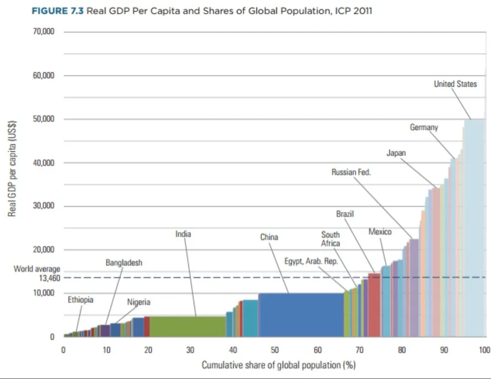
Recently, while discussing this topic in a WeChat group, I was suddenly reminded of that chart. However, after a thorough search, I couldn’t find the original one. I only came across a similar image from the World Bank dated 2011, but it was vastly different from what I remembered. That chart simply arranged countries horizontally by their GDP per capita and lacked the striking visual impact.
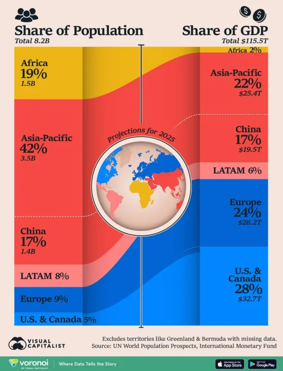
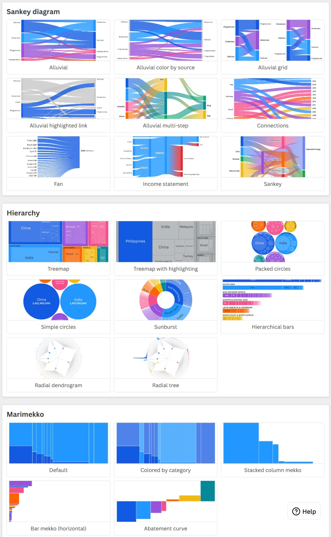
Currently, mainstream visualizations for this type of data often use Sankey diagrams or Marimekko charts. I also tried using online tools like Datawrapper and Flourish, but the results were less than satisfactory.
The reason pyramid-style charts are more intuitive and striking is that they tap into humanity’s millennia-old cultural perception of hierarchical order. At the base of the pyramid lies the vast population of developing countries, yet they typically account for only a small share of the world’s economic output. Meanwhile, developed nations, with fewer people, reap the majority of economic benefits.
Eventually, I gave up searching for an off-the-shelf solution and decided to create the chart myself.
The Chart Creation Process
The process of creating the chart proved to be more troublesome than I had anticipated. Initially, I thought about using Excel and WPS, especially since WPS members have access to a vast library of templates. However, after some experimentation, I encountered a significant issue: it was difficult to properly map the data to the charts.
I used the latest population and GDP per capita data from the World Bank, which includes 217 countries and economic entities, as well as 47 regions or economic organizations. Among these, large countries like China and India have populations of 1.4 billion, while many smaller countries or regions have only a few hundred thousand or even tens of thousands of people. The difference between the maximum and minimum values is tens of thousands of times. This posed a nightmare scenario for creating charts in Excel.
In the end, I turned to Python for plotting, as it allowed me to fine-tune the many parameters required.
For instance, in a standard-sized chart, it is impossible to display the names of every country and region. Deciding which country names to show is a question worth exploring. Considering the vast differences in the final displayed area for each country’s population, the best approach was clearly to set the display based on the final area proportion. If the area was too small, the name couldn’t be shown.
For example, when mapping the global population onto the pyramid, I had to meticulously calculate the proportion of the image occupied by each country or region’s population data. This proportion actually corresponds to the area of the trapezoid for each level in the pyramid (except for the very top, which is a triangle).
After dozens of adjustments and iterations, I eventually produced three versions of the chart.
Population Pyramid Sorted by GDP per Capita
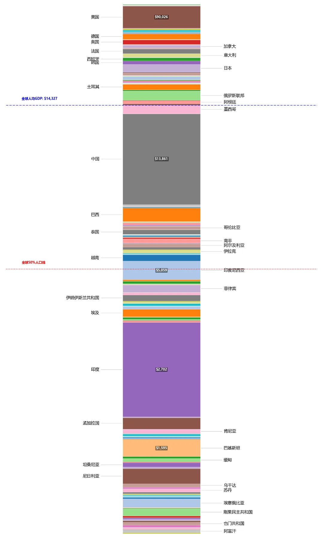
This first version is the closest to what I remember seeing. When I fed the latest data into this dynamically generated pyramid model, the visual impact was immediate. In this chart, the global population is rearranged and stacked from bottom to top according to per capita wealth.
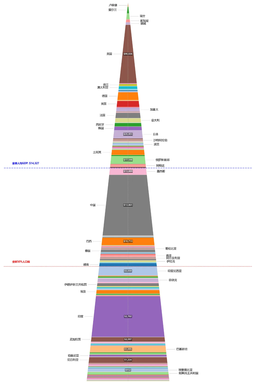
On this pyramid, I drew two lines. One is the global average GDP per capita line (blue dashed line: $14,327), and the other is the global 50% population line (red dashed line). Once these two lines were added, the “soul” of the chart emerged, starkly revealing three sobering realities:
First, China stands at the “tipping point” of the global average per capita income. The chart clearly shows China as a massive, thick wall firmly planted in the middle of the pyramid. We are just one step away from the global average. Above us lies the world that has crossed the average line; below us is an even larger low-income group.
Second, there is a stark mismatch between wealth and population. Look at the red 50% population dividing line. If the world were equitable, once half the population was reached, the wealth they command should also be half. However, the reality is that the red line (global 50% population) is pressed extremely low, even far below the blue GDP per capita line. This means that over 50% of the world’s population has a per capita GDP of less than $5,059. The wealthiest half of the global population takes the lion’s share of the economic pie, far exceeding their population proportion. At the very top of the pyramid, countries like Luxembourg, Switzerland, Norway, and the United States—which occupies a significant thick block of color—have relatively small population areas but command unimaginable wealth.
Third, the real world is masked by “averages.” According to the latest World Bank data, the global GDP per capita in 2025 is approximately $14,327 (calculated from data for all countries and regions in the database, slightly differing from news figures). However, if you look closely at the chart, you’ll notice that very few countries actually live above this blue average line. Apart from a handful of nations like those in Europe, the US, Japan, South Korea, and Saudi Arabia, most of the pyramid’s substantial bulk lies below this line. In other words, the vast majority of the world’s population is “forced above average” by the tiny minority of “super-rich” countries at the pyramid’s apex.
Population Bar Chart Sorted by GDP per Capita
This is the second chart I created. While the pyramid chart is visually striking, it has an unavoidable physical flaw in its mathematical representation: to maintain “area conservation” within its tapering top, countries with high GDP per capita (like the US and European nations) have their vertical heights artificially stretched. This can create the illusion that these countries also have a large population share.
On this chart, I kept the same two lines. However, a notable difference is that these lines are now positioned at about the top 1/5 and 1/2 of the overall image height. This is a significant shift from the pyramid chart, where they roughly divided the image height into thirds.
This drastic vertical shift squeezes out the visual distortion caused by the pyramid’s shape, revealing the truest physical proportions directly.
The true 50% population mark (red line) returns to the physical midpoint (1/2). Without the broadening base of the pyramid to mask it, the red line sits squarely in the middle. This allows us to see more intuitively that the 1.4 billion Chinese people are situated in the global range of roughly 24% to 40%. The population we need to catch up to ahead of us is now less than a quarter of the world’s total.
Compared to the pyramid, the bar chart makes the “80/20 rule” much more concrete visually. The global average GDP per capita line is pushed up to about the top 20% height. This uses the most honest geometric language to show that truly only about 20% of the global population crosses this average line, leaving the remaining 80% below it. Apart from the US, other developed countries appear as mere thin slivers at the very top of the human column.
However, while the bar chart achieves “absolute truth” in terms of population proportions, it has its limitations. Because each layer has the same width, it completely obscures the absolute total wealth. This led me to create a third chart.
Combined Population Pyramid and GDP Comparison Chart
Since a single-dimensional graphic always involves compromises, I decided to combine them. I made a bolder attempt, keeping the population pyramid on the left and displaying total GDP on the right.
This is the chart I find most logically robust.
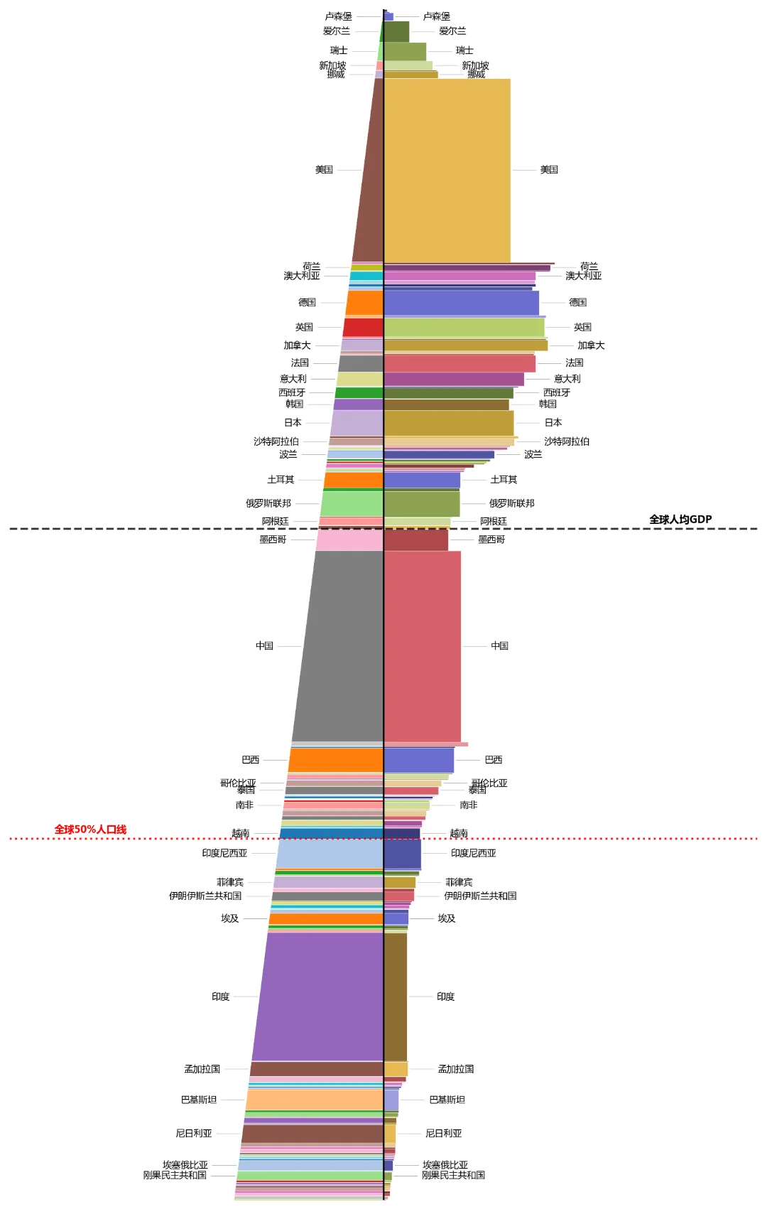
To make this chart mathematically and visually coherent, I re-derived the geometric algorithms for both sides. Since both sides share the same Y-axis height, which is determined by population proportions, the width of the blocks on the right—if their area is to strictly represent the country’s total GDP—cannot be mapped linearly using simple numerical values. Instead, the width must be recalculated using a formula: Width = (Country's GDP Global Share ÷ Country's Vertical Height in the Chart) × Scaling Factor.
Through this physical constraint of “area conservation,” the area of each rectangle on the right genuinely corresponds to its true share of the global GDP total.
When the final chart appeared on the screen, the stark contrast between the two sides instantly stretched the entire graphic into a shape resembling a parallelogram.
First, the “imbalance” between the top and bottom. At the very top of the image, the developed countries with extremely high GDP per capita occupy a pitifully small population share on the left. However, to accommodate their immense total wealth within such a narrow vertical thickness, the width on the right is stretched dramatically. Visually, this manifests as the right side jutting outwards forcefully, creating a vast canopy of wealth. Conversely, at the bottom of the image, the developing countries with large populations command a very prominent visual space on the left. Yet, on the right, their economic contribution is compressed into thin, narrow slivers, almost hugging the central black axis, barely visible as faint lines.
Second, China stands as a balancing giant on both sides of the central axis. In this dramatically shifting “parallelogram”-like spectrum, China displays a tremendously powerful presence. We are no longer the extremely narrow appendage leaning to one side at the top, nor the nearly invisible thin line at the bottom. China possesses a thick wall of population on the left and simultaneously commands a vast, solid red economic block on the right. In this unequal world landscape, China props up a very considerable area on both sides, truly acting as the “ballast stone” maintaining the balance of the global population and economic gravitational field.
Third, the silent world below the “black chasm.” If we follow the black dashed line representing the global average GDP per capita downwards, we see that, except for the massive exception of China, almost all developing countries and regions below this line experience a significant shrinkage in their right-side blocks. This line acts like an invisible chasm, dividing the world into two parts: above it lies a world of few people but immense, bloated wealth; below it lies a world of billions but near-silent in the grand map of economic output.