In recent years, under the guise of “the capable should do more,” I’ve taken on many tasks outside my department’s scope, one of which is creating PPTs for various units within our organization. The effort involved in making PPTs is something only those who have done it can truly understand. However, the amount of thought and effort invested doesn’t always translate into equivalent recognition. The more you do, the more mistakes you might make. Doing well is expected, and any dissatisfaction can easily land you in hot water.
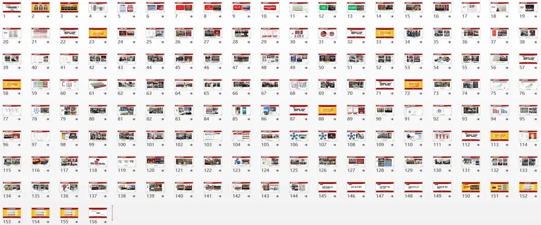
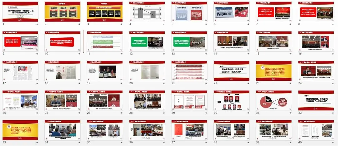
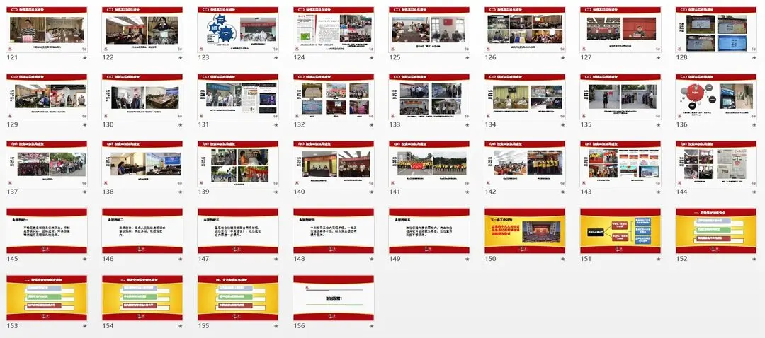
In 2017, I primarily worked on four PPTs. Two of these were departmental work summaries, each only about 10 pages long, while the other two were 30+ and 180+ pages respectively.
Here are some key takeaways from my experience:
1. Leverage Templates: A well-designed template can be universally applied to government agency PPTs


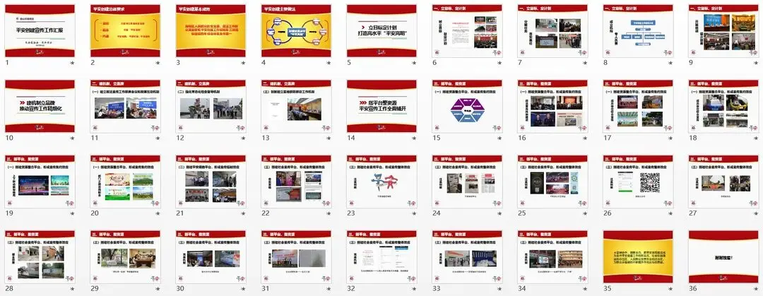
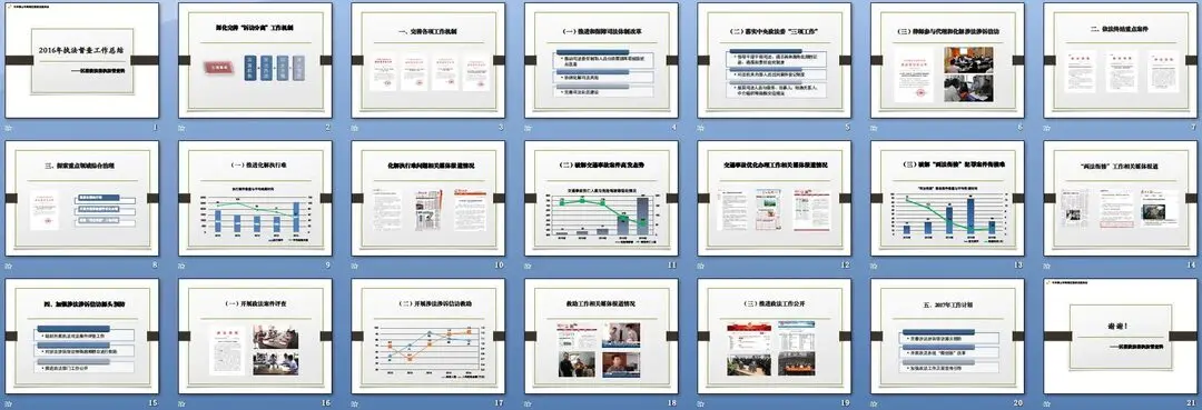
This template consists of only three pages, using the red, yellow, and white color scheme commonly used by state agencies. It has been used continuously for three years and has been presented at various meetings. The first page is for the main title and primary headings; the second page emphasizes important content; and the third page is for general content.
2. Choose Fonts Carefully: The fonts used in government meeting PPTs should align with those in official documents
Common fonts in government documents include only four types: Fangzheng Xiaobiao Song, Fangsong GB2312, Heiti, and Kaiti GB2312. Songti is used sparingly, such as in document page numbers.
To maintain the seriousness of official PPTs, after testing various fonts, the most suitable ones for PPTs are Heiti, Kaiti, and Fangzheng Xiaobiao Song.
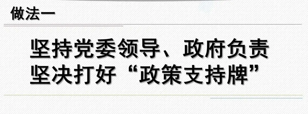
For example, I prefer using Heiti. A single PPT can often be effectively designed using just Heiti, with variations in shadow and bold effects to indicate different levels of hierarchy.
3. Utilize Master Slides: The first step after selecting a template is to edit the master slides
The design of PPT master slides represents the structural hierarchy of the entire presentation. Official PPTs usually have clear scripts, making the content hierarchy straightforward. Incorporating main and subheadings into the master slide design can prevent unnecessary transitions during slide changes.
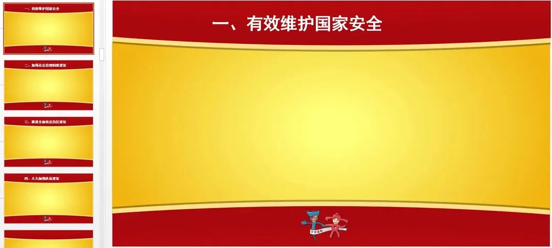
Primary and secondary headings can be directly integrated into the master slides, ensuring consistent positioning and avoiding issues like misaligned headings.
3. Leverage WeChat: It’s one of the most convenient ways to find images today
The biggest challenge in creating PPTs is the lack of materials, as it’s hard to predict what content will be needed beforehand. For instance, when departments in my unit provide materials, they either dump tens of thousands of photos on a hard drive or offer a few irrelevant images. If the unit has strong coordination capabilities, this issue is less pronounced, but in my experience, it’s a common problem. Those who haven’t made PPTs often don’t know how to find or use materials, making their contributions usually futile.
Fortunately, with the rise of WeChat, most government agencies now use it as their primary platform for external communication. Most photos on official WeChat accounts have already been screened and are content-specific. By effectively using WeChat’s search function, you can quickly find relevant content.
For example, while creating this PPT, departments provided tens of thousands of photos, but most were of poor quality. Ultimately, over 300 photos used in the PPT were sourced from WeChat.
4. Use Charts: While photos show what was done, charts demonstrate the effectiveness of the work
In the years of combating the “Four Malfeasances” and implementing the “Eight Regulations,” a noticeable trend is the need for supporting materials for any work done, with photos being the best evidence. It’s as if not taking photos means the work wasn’t done. Therefore, leaders often place great importance on the photos in PPTs or similar promotional materials, with specific images being predetermined.
However, too many photos can cause visual fatigue. Incorporating appropriate charts can better illustrate the effectiveness of the work.
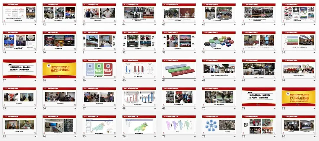
For instance, in this PPT, I created about forty charts to make the slides less monotonous.
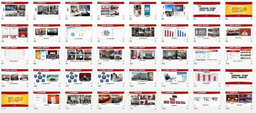
5. Avoid Omissions: One of the most important philosophies in government work is not to overlook people or tasks
In any work report, certain areas will inevitably be emphasized, but it’s crucial not to completely ignore the work of other departments within the same unit. My unit is divided into over ten sectors, each overseen by one of six leaders. In more comprehensive reports, while focusing on a few key departments, I ensure that each sector is represented, even if only with a single image or sentence, to avoid unnecessary complications.
Government agencies strive for comprehensiveness; it’s better to have too much content than to miss something. Most people haven’t actually made PPTs and think it’s just about “pasting text and images.”
6. Minimize Text: Leaders’ aesthetic standards have improved in recent years, and too much text is no longer suitable
A few years ago, most government PPTs were text-heavy, sometimes even including the entire report script, making them tedious to listen to and read. However, they can’t be as minimalist as presentation slides, as most government reports are read from scripts, leaving little room for improvisation.
7. Avoid Taking on Too Much
This is the most profound lesson I’ve learned in recent years—getting stuck in a quagmire with no way out.